VISUAL IDENTITY
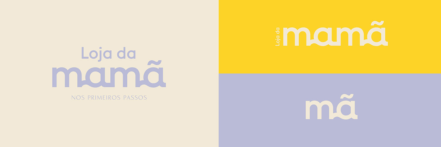
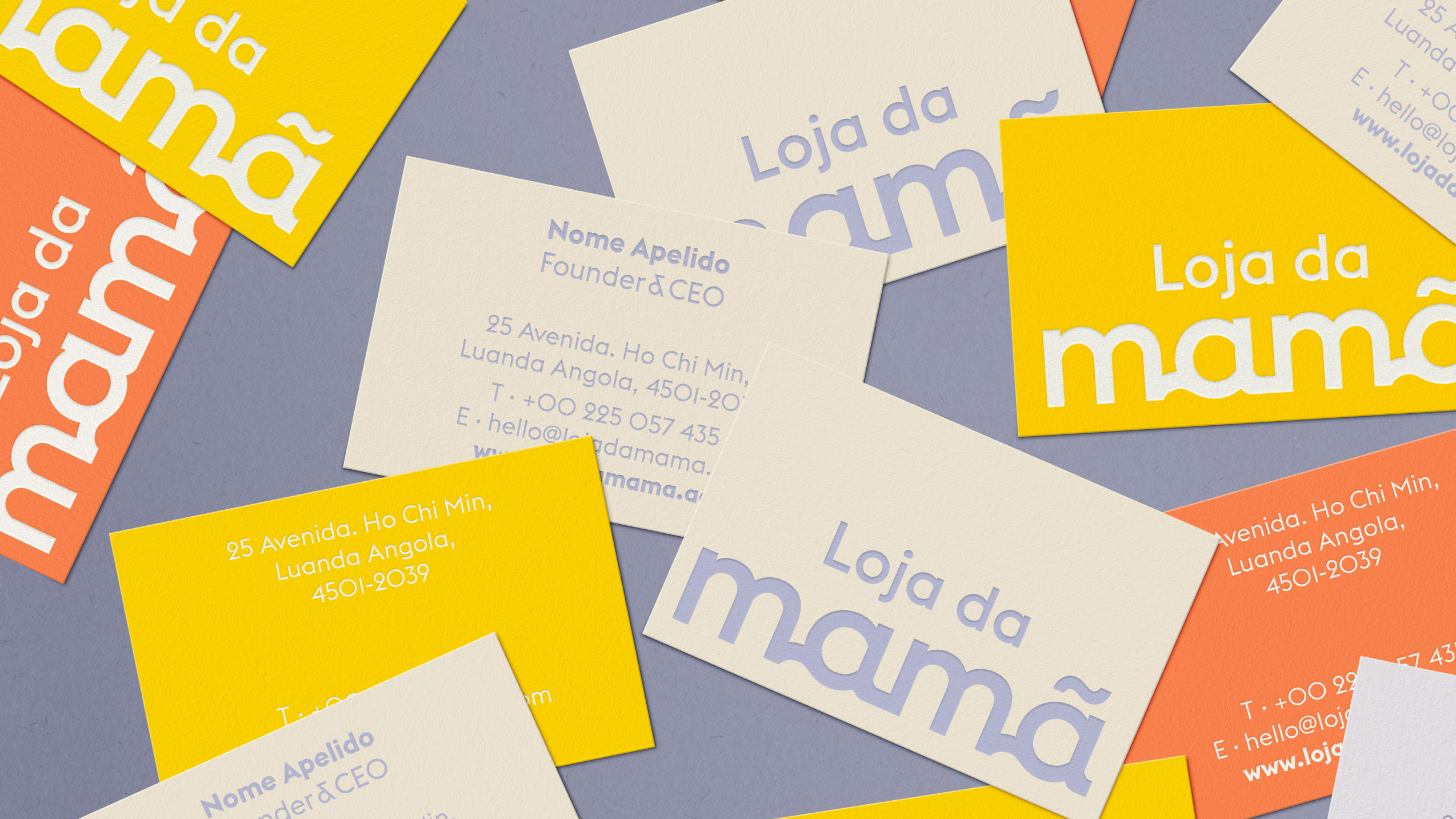
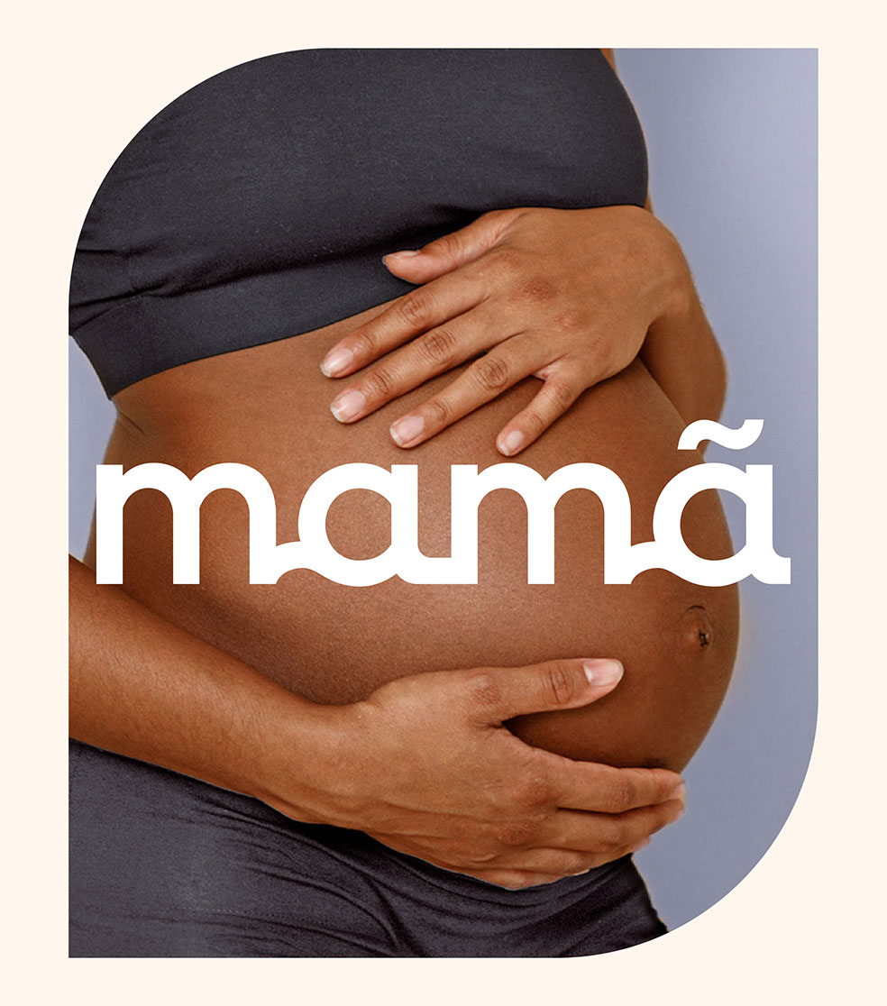
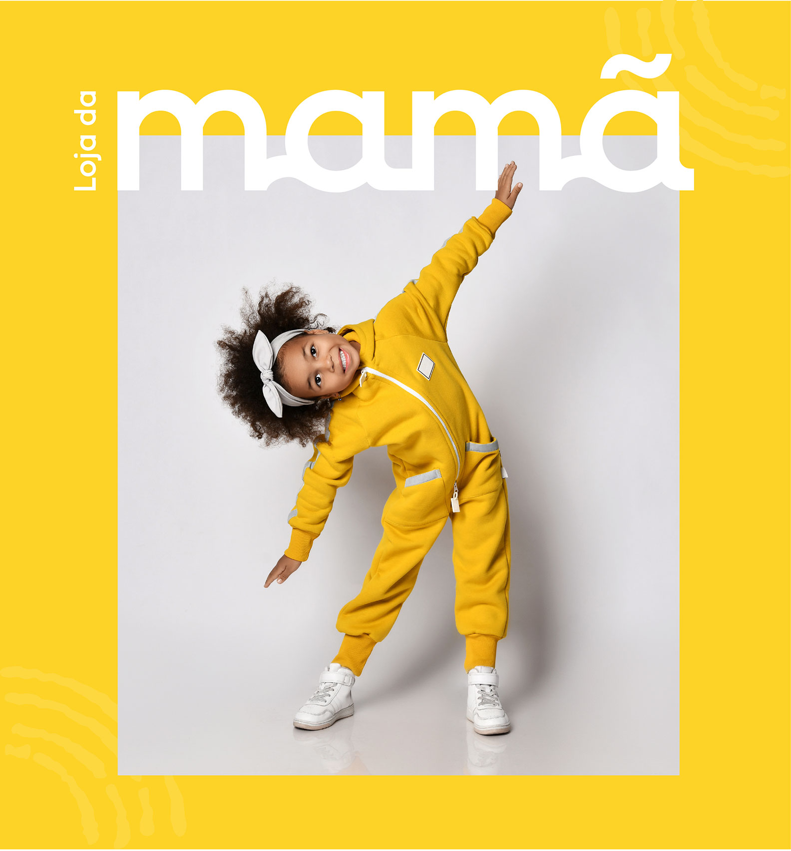
LOGOTYPE
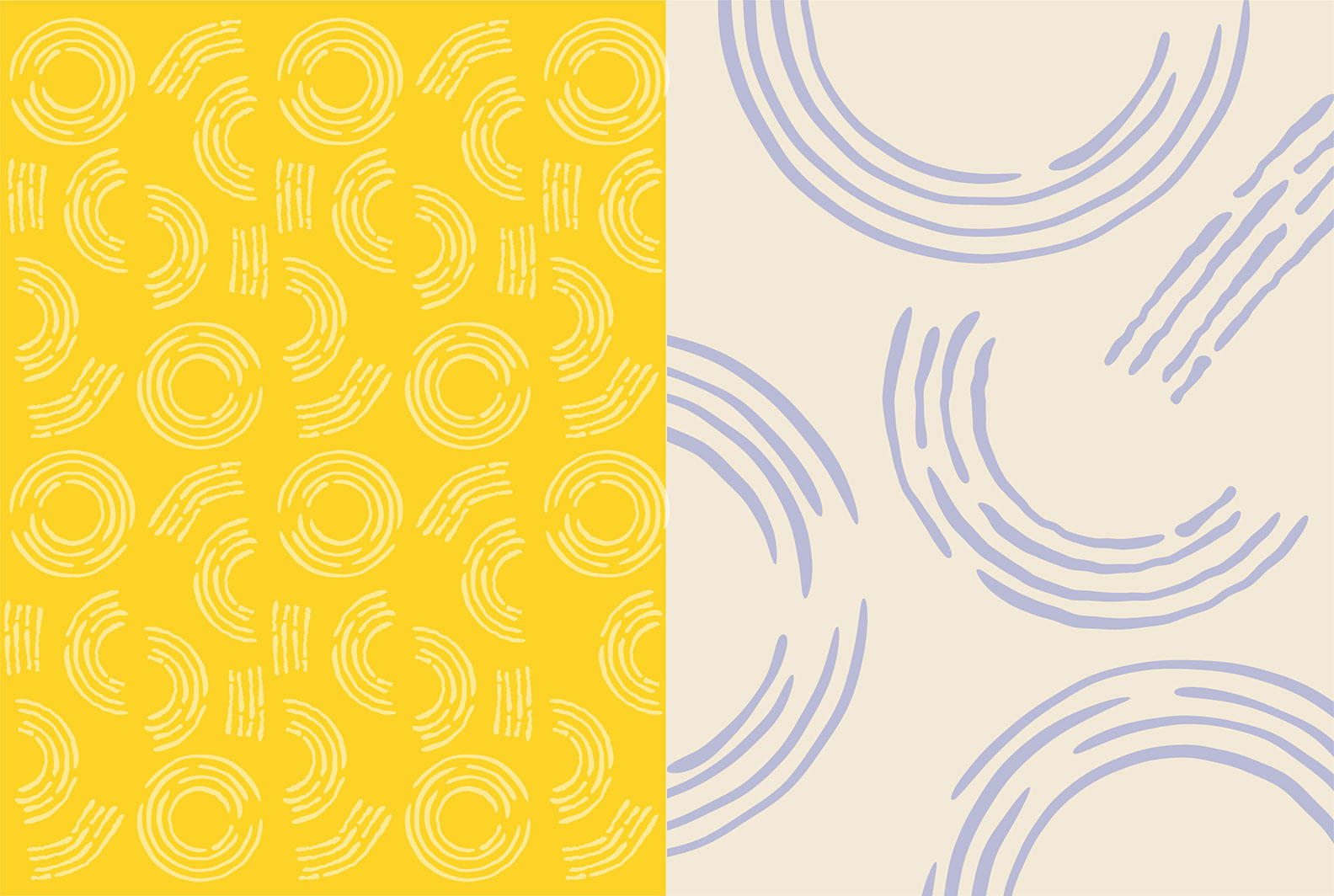
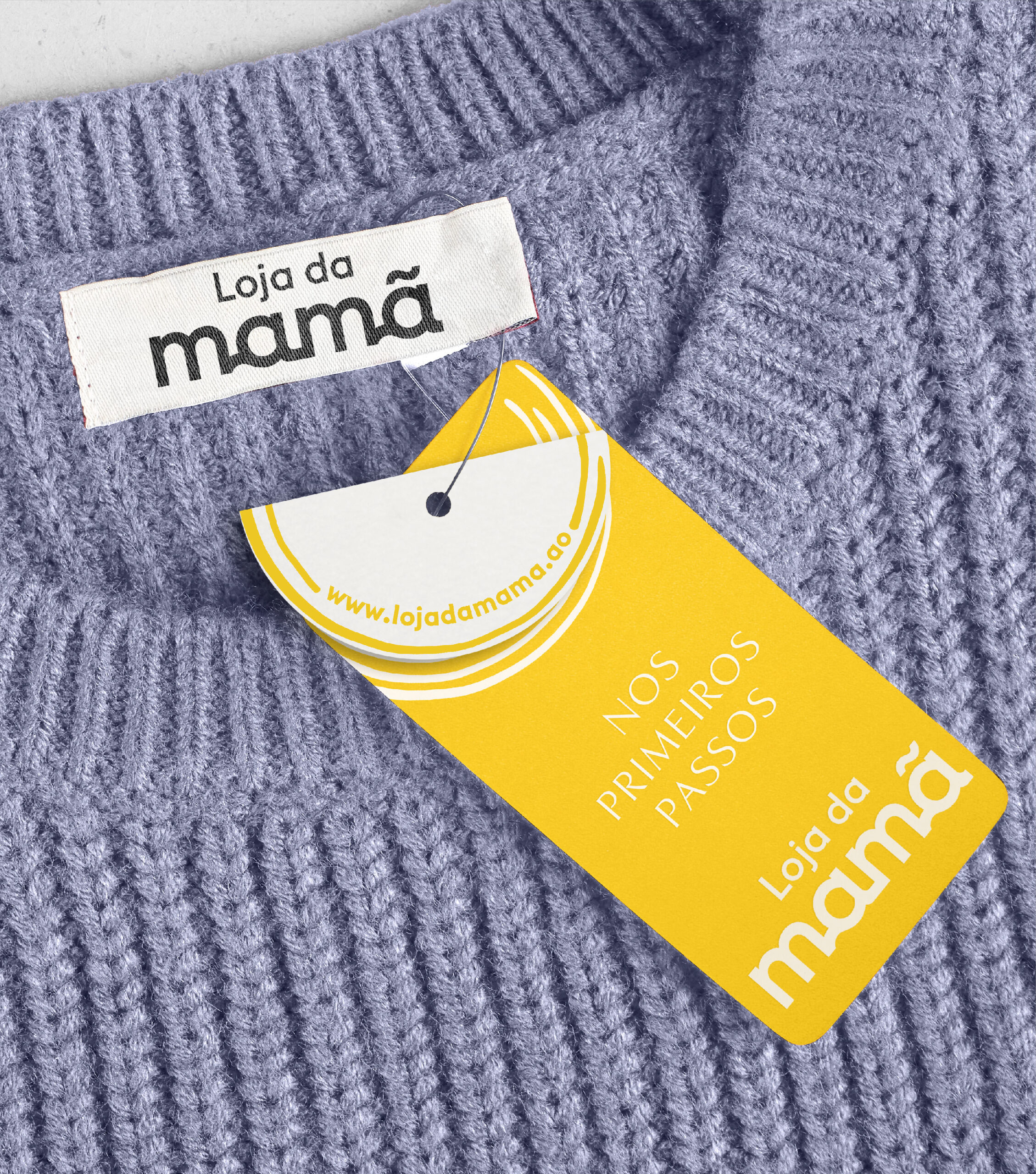
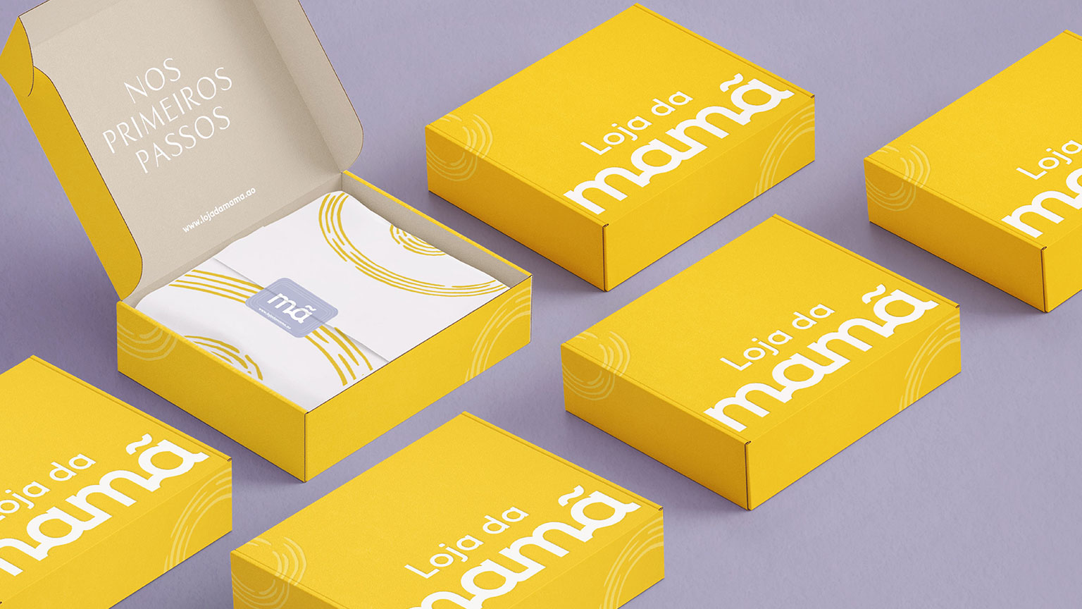
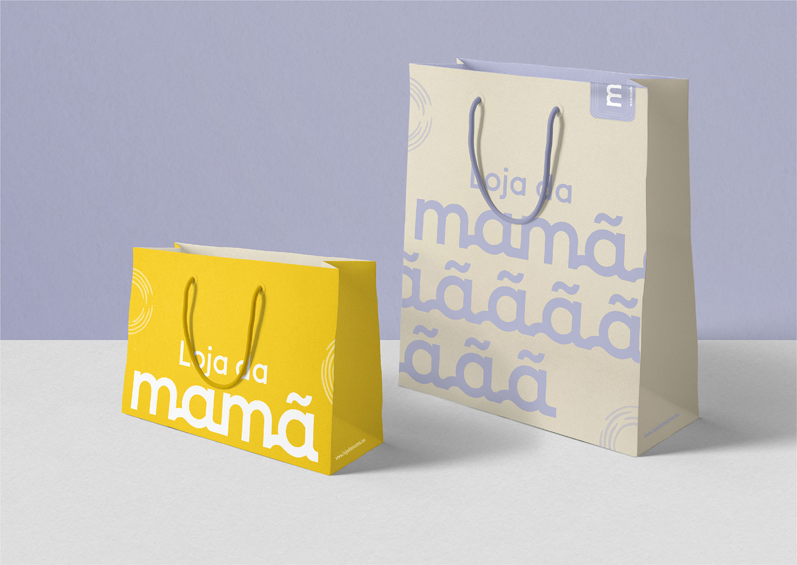
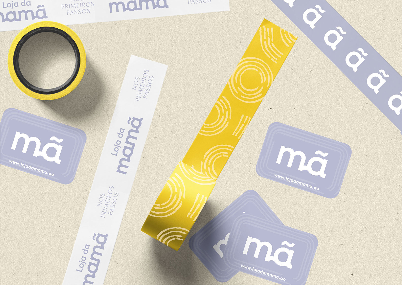
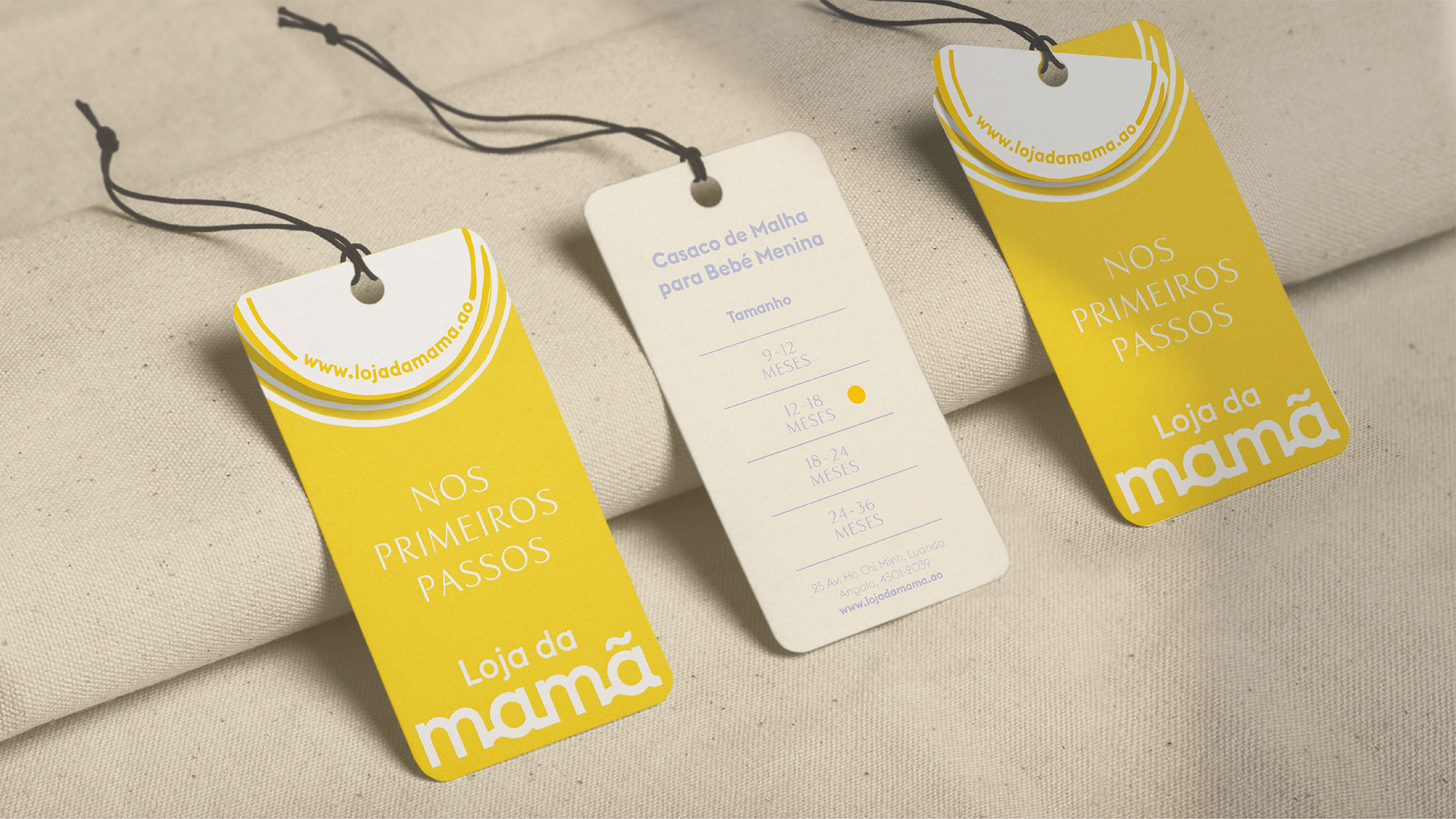
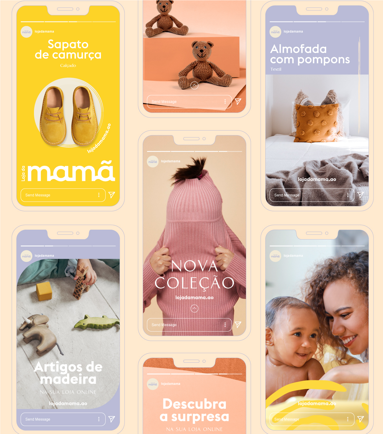
PACKAGING
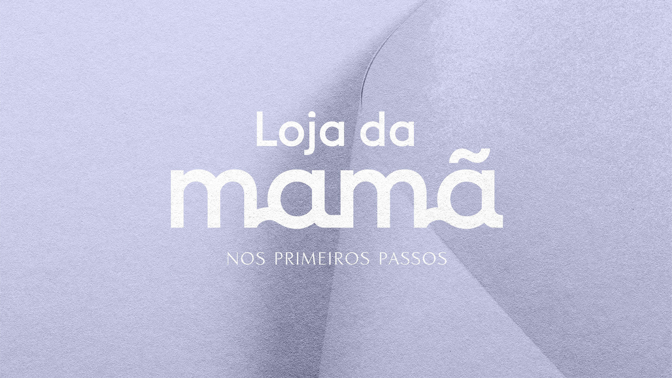
LOJA DA MAMÃ IS A CLOTHING, ACCESSORIES AND DECORATION BRAND DEDICATED TO FUTURE MOTHERS, MOTHERS AND BABIES WHERE THE QUALITY OF ITS PRODUCTS AND CUSTOMER SUPPORT SERVICE STAND FOR ITS QUALITY AND DISTINCTION.
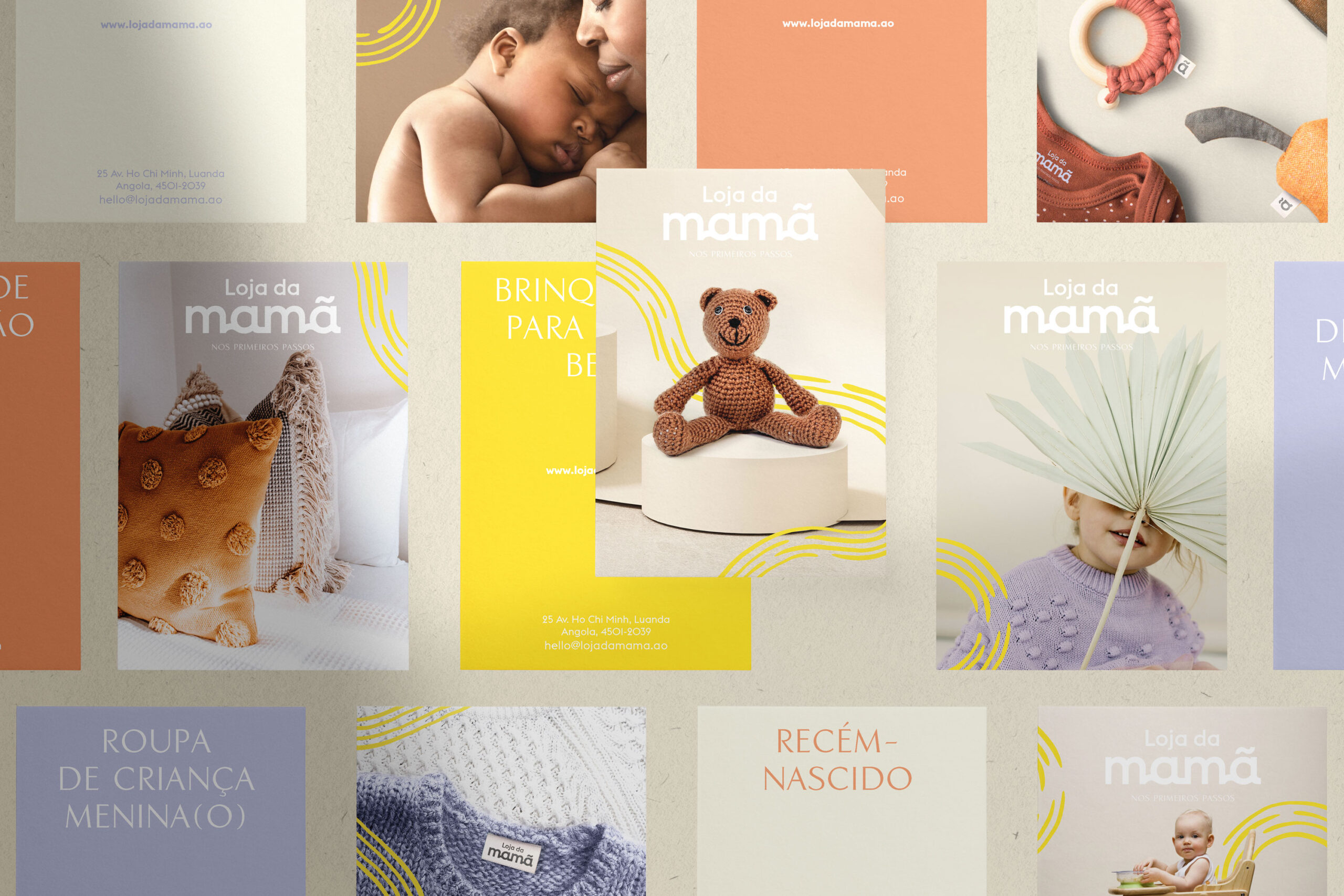
NOS PRIMEIROS PASSOS
The main challenge is to create identity with a careful and loving record.
The intention is to generate a bond of trust between the brand and the target audience in a sensitive and vulnerable period where pregnant women are often mothers for the first time.
The concept — In the first steps
Loja da Mamã seeks to support pregnant and pregnant women after the birth of their baby. In this way, we created a brand “in the first steps” to demonstrate that the brand will be present in this unique moment for the target, suggesting – Loja da Mamã will be present “in the first steps” of both the new mother and “in the first steps” make babies.
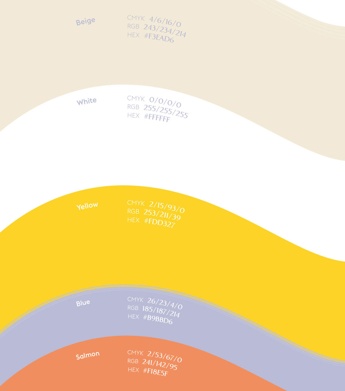
The chromatic choice is associated with the context of happiness and comfort.
Yellow, as the main color, found in the flag of Angola (the brand’s country of origin), transports us to a smiling, happy world of growth and optimism.
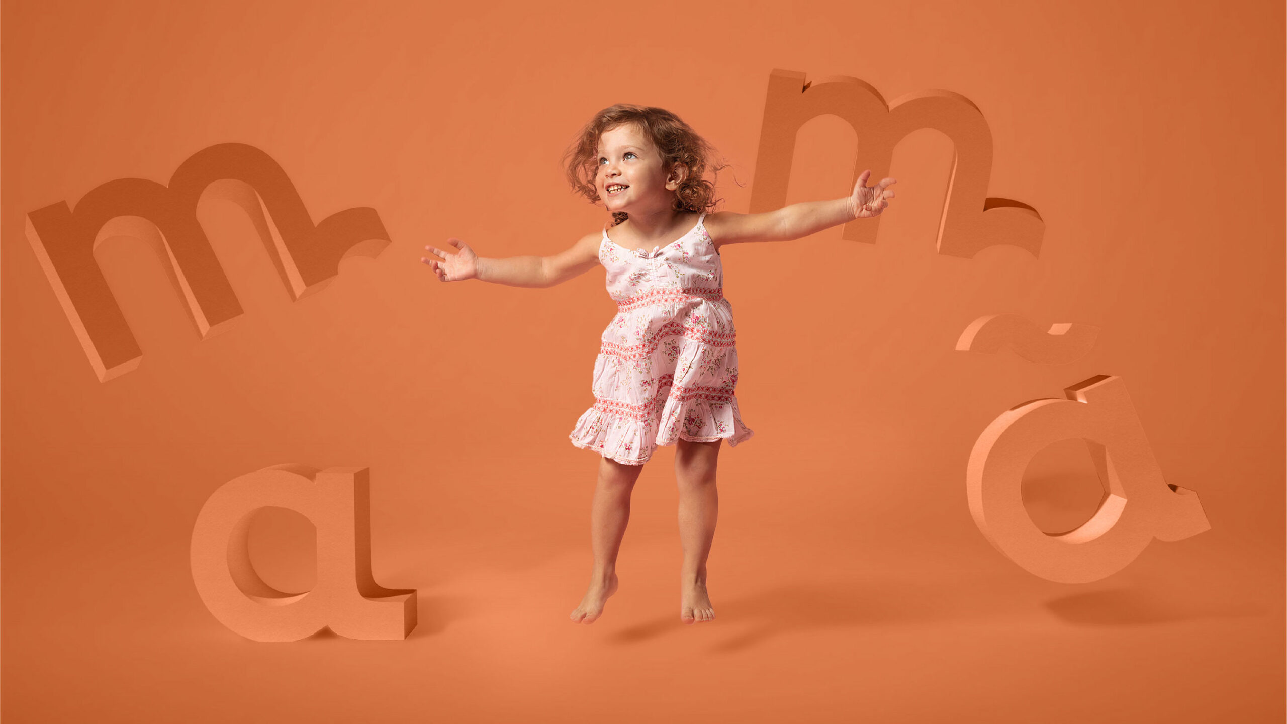
Beige takes us to the maternal side (comfort and delicacy), while white is associated with purity and authenticity. As secondary colors we opted for lilac and salmon, both with different intentions. Lilac symbolizes magic, imagination and transformation, while salmon is a warmer color, which enhances the deeper and more sentimental side of the union between the baby and the mother.